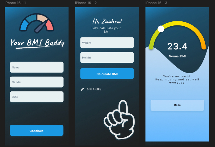
From Design to Code - Creating “Your BMI Buddy” with Flutter [Part 1]

![From Design to Code - Creating “Your BMI Buddy” with Flutter [Part 1]](/content/images/size/w2000/2025/10/From-Design-to-Code---Creating--Your-BMI-Buddy--with-Flutter--Part-1-.png)
Today, I’m excited to introduce my very own design — Your BMI Buddy!
Honestly, it wasn’t easy getting this done, and I have to say — hats off to all the designers out there! This may not be the most perfect design yet, but I’m still learning and trying to apply all the right design principles and guidelines — so bear with me.
Let’s skip the design talk for now and move straight into the code.
The sample project
You can find the sample project right here.
The starter project with assets
I've set up a starter branch where all the required assets are already included in the new app, so you won’t have to worry about setting those up manually.
Normally, images and content would come from a backend, but for this tutorial, we’ll focus on:
- Building the UI
- Writing the logic
- Running some unit tests (already included)
- Integrating an AI Agent
Our app is composed of three main screens:
- HomeScreen
- CalculatorScreen
- ResultScreen
Building the Home Screen
Okay let us get started with our home screen.
You’ll notice that the background has a gradient color effect.
Here are the colors I used:
0xFF0F2333

0xFF247BA0

0xFF189AE5
We’ll create this gradient using the DecoratedBox widget, which allows us to apply a LinearGradient directly.
import 'package:flutter/material.dart';

class HomeScreen extends StatelessWidget {
  const HomeScreen({super.key});

  @override
  Widget build(BuildContext context) {
    return Scaffold(
      body: SizedBox(
        width: MediaQuery.of(context).size.width,
        height: MediaQuery.of(context).size.height,
        child: DecoratedBox(
          decoration: BoxDecoration(
            gradient: LinearGradient(
              begin: Alignment.bottomRight,
              end: Alignment.topLeft,
              colors: <Color>[
                Color(0xFF0F2333),
                Color(0xFF247BA0),
                Color(0xFF189AE5),
              ],
              stops: [0.50, 0.90, 1.00],
            ),
          ),
          // TODO: build the screen
          // child: Container(),
        ),
      ),
    );
  }
}
To achieve this gradient background:
- The entire screen is wrapped inside a
SizedBoxwith its width and height set usingMediaQuery.of(context).size.widthandMediaQuery.of(context).size.height. - Inside it, we use a
DecoratedBoxwith aBoxDecorationthat includes aLinearGradient. - The
LinearGradientdefines where the color begins and ends (bottomRighttotopLeft), the list of colors, and their positions (stops).
Setting up other structures
To keep our code organised, we will create a separate widget called HomeContent() instead of placing everything inside HomeScreen().
An alternative would be to create a helper method within the same class, but that approach can lead to unnecessary widget rebuilds, which affects performance.
Our design has three main components:
- Logo
- TextFields
- Primary Button
Let’s define these as separate widgets.
class HomeContent extends StatelessWidget {
  const HomeContent({super.key});

  @override
  Widget build(BuildContext context) {
    return Padding(
      padding: const EdgeInsets.symmetric(
        vertical: 72.0,
        horizontal: 32,
      ),
      child: Column(
        children: [
          // LogoWidget
          // CustomTextFields
          // CustomPrimaryButton
        ],
      ),
    );
  }
}
class LogoWidget extends StatelessWidget {
const LogoWidget({super.key});
@override
Widget build(BuildContext context) {
return Container();
}
}class CustomTextFields extends StatelessWidget {
const CustomTextFields({super.key});
@override
Widget build(BuildContext context) {
return Container();
}
}class CustomPrimaryButton extends StatelessWidget {
const CustomPrimaryButton({super.key});
@override
Widget build(BuildContext context) {
return Container();
}
}Now let us create these widgets one by one.
Creating the Logo
Our logo comes from the assets folder.
Here’s the widget for that:
class LogoWidget extends StatelessWidget {
  const LogoWidget({super.key});

  @override
  Widget build(BuildContext context) {
    return Image.asset(
      "assets/logo.png",
    );
  }
}
Don’t forget to include the assets in your pubspec.yaml file:
After adding this image, you need to run flutter pub get.
  assets:
    - assets/
Creating the textfields section
The TextField widget in Flutter is powerful and highly customizable.
Here’s how we’ll structure our custom version:
class CustomTextFields extends StatelessWidget {
  final Key keyValue;
  final TextEditingController controller;
  final ValueChanged<String> onChanged;
  final String hintText;
  const CustomTextFields({
    super.key,
    required this.keyValue,
    required this.controller,
    required this.onChanged,
    required this.hintText,
  });

  @override
  Widget build(BuildContext context) {
    return TextField(
      key: Key(keyValue.toString()),
      controller: controller,
      onChanged: onChanged,
      decoration: InputDecoration(
        hintText: hintText,
        hintStyle: GoogleFonts.inter(
          textStyle: TextStyle(
            color: Color(0xFF546A7B),
            fontSize: 14,
          ),
        ),
        border: OutlineInputBorder(
          borderRadius: BorderRadius.circular(12),
        ),
        filled: true,
        fillColor: Color(0xFFE8F1F2),
      ),
    );
  }
}
Our textfield takes a key, controller, onChanged, and decoration.
- Key is required to be set because we are using this for our widget testing
- The
controllerlets you manage text changes. onChangedtriggers whenever the user types.- The
InputDecorationdefines visual styles. In this case, a soft background color, rounded corners, and a light hint text.
Creating the primary button
class CustomPrimaryButton extends StatelessWidget {
  final VoidCallback onTap;
  final String buttonName;

  const CustomPrimaryButton({
    super.key,
    required this.onTap,
    required this.buttonName,
  });

  @override
  Widget build(BuildContext context) {
    return Material(
      color: Colors.transparent,
      clipBehavior: Clip.none,
      child: InkWell(
        onTap: () => Navigator.push(
          context,
          MaterialPageRoute(
            builder: (context) => CalculatorScreen(),
          ),
        ),
        child: DecoratedBox(
          decoration: BoxDecoration(
            borderRadius: BorderRadius.circular(12),
            color: const Color(0xFF1B98E1),
            boxShadow: const [
              BoxShadow(
                color: Color(
                  0x33247BA0,
                ),
                offset: Offset(0, 5),
                blurRadius: 14,
                spreadRadius: 0,
              ),
            ],
          ),
          child: SizedBox(
            width: double.infinity,
            child: Center(
              child: Padding(
                padding: const EdgeInsets.all(18.0),
                child: Text(
                  "Continue",
                  style: GoogleFonts.inter(
                    color: Colors.white, // make text solid white
                    fontWeight: FontWeight.bold,
                    fontSize: 16,
                  ),
                ),
              ),
            ),
          ),
        ),
      ),
    );
  }
}
- While
ElevatedButtonis great, here we need a custom shadow and more flexibility. - Using
InkWellinside aDecoratedBoxgives us both. Full control over design and a ripple effect when tapped. - We’re using a simple navigation method with
MaterialPageRoute, but you can easily swap this with more advanced routing later.
Bringing it all together
Now that we have built our HomeContent widget, let’s bring everything together inside the HomeScreen class.
class HomeScreen extends StatefulWidget {
  const HomeScreen({super.key});

  @override
  State<HomeScreen> createState() => _HomeScreenState();
}

class _HomeScreenState extends State<HomeScreen> {
  late TextEditingController nameController;
  late TextEditingController genderController;
  late TextEditingController dobController;

  String bmi = "";

  @override
  void initState() {
    super.initState();
    nameController = TextEditingController();
    genderController = TextEditingController();
    dobController = TextEditingController();
  }

  @override
  void dispose() {
    nameController.dispose();
    genderController.dispose();
    dobController.dispose();
    super.dispose();
  }

  @override
  Widget build(BuildContext context) {
    // var bmiResult = displayBMI();
    final calc = const Calculator();
    final bmiResult = calc.displayBMI(
      nameController.text,
      genderController.text,
    );

    void onAnyFieldChanged(String _) => setState(() {});

    return Scaffold(
      body: SizedBox(
        width: MediaQuery.of(context).size.width,
        height: MediaQuery.of(context).size.height,
        child: DecoratedBox(
          decoration: BoxDecoration(
            gradient: LinearGradient(
              begin: Alignment.bottomRight,
              end: Alignment.topLeft,
              colors: <Color>[
                Color(0xFF0F2333),
                Color(0xFF247BA0),
                Color(0xFF189AE5),
              ],
              stops: [0.50, 0.90, 1.00],
            ),
          ),
          child: HomeContent(
            nameController: nameController,
            genderController: genderController,
            dobController: dobController,
            onChanged: onAnyFieldChanged,
          ),
        ),
      ),
    );
  }
}
HomeScreen needs to store and manage state as the user types.
- We create 3 textfield controllers (
nameController,genderController,dobController) to handle user input. - The
initState()method runs once when the widget is inserted into the widget tree, allowing us to initialize the controllers. - The
dispose()method is called when the widget is removed, ensuring we properly release memory and avoid leaks. - Whenever a field value changes, we call
setState()(insideonAnyFieldChanged) so the UI updates immediately with the latest data.
And we are done for the HomeScreen!
Next, we’ll move on to building the calculator screen.
Learn more about Stateless/Stateful & Lifecycle
 Umme Faatimah-Iz-Zaahra Mujore
 Umme Faatimah-Iz-Zaahra Mujore
 Umme Faatimah-Iz-Zaahra Mujore
About Me
I am Zaahra, a Google Women Techmakers Ambassador who enjoy mentoring people and writing about technical contents that might help people in their developer journey. I also enjoy building stuffs to solve real life problems.
To reach me:
LinkedIn: https://www.linkedin.com/in/faatimah-iz-zaahra-m-0670881a1/
X (previously Twitter): _fz3hra
GitHub: https://github.com/fz3hra
Cheers,
Umme Faatimah-Iz-Zaahra Mujore | Google Women TechMakers Ambassador | Software Engineer