Flutter Layouts - Part 1
Understanding Column and Row layouts: MainAxisSize, MainAxisAlignment and CrossAxisAlignment
In Flutter, the layout of widgets in a Row or Column is crucial for creating well-structured user interface. To achieve this, you need to understand the concepts of MainAxisSize, MainAxisAlignment, and CrossAxisAlignment.
- mainAxisSize.
According to the Flutter Documentation, the MainAxisSize is a property that allows us to determine how much space a Row or a Column can occupy on their main axes.
The row's main axis is the horizontal axis while the column's main axis is the vertical axis.
The 2 possible set of values that mainAxisSize allows are:
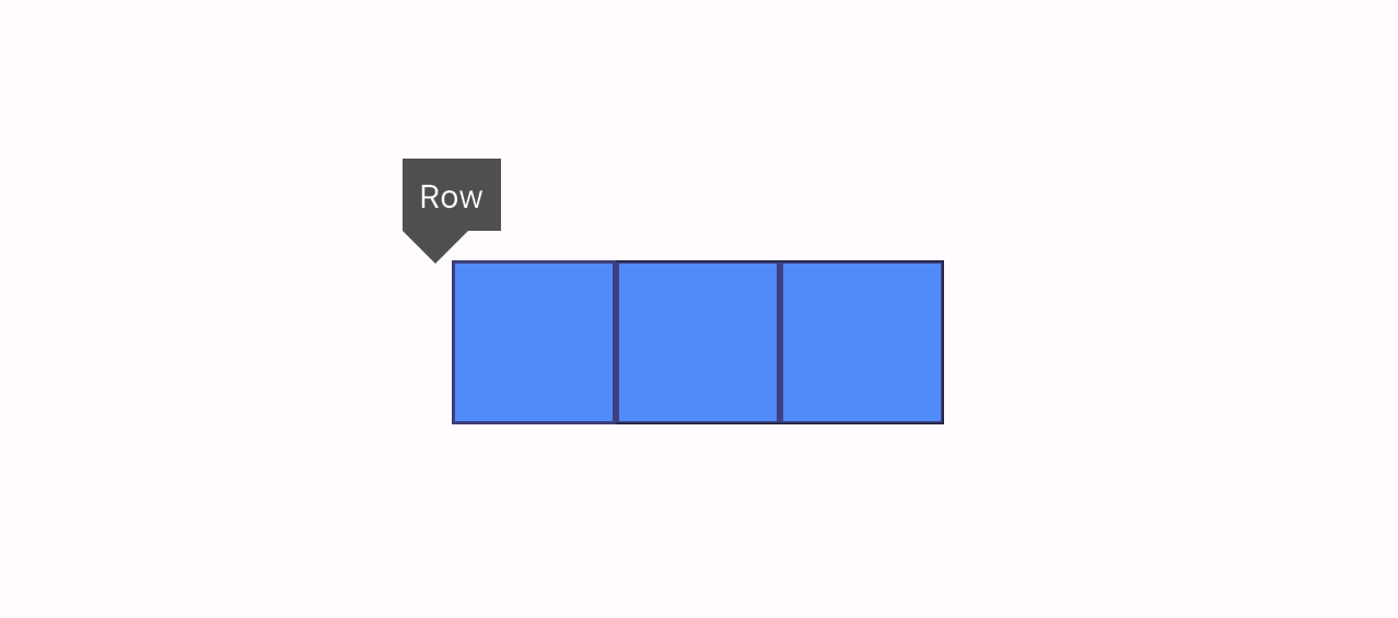
- MainAxisSize.min
With this setting, the children of the row or the column will be squeezed together, occupying enough space on their main axes.
Representation:
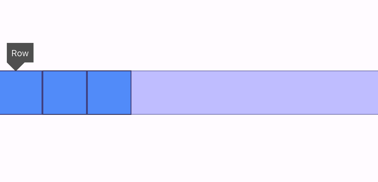
- MainAxisSize.max
When MainAxisSize is set to max, the children of the Row or Column will distribute space along their main axes, allowing them to fully utilize the available space.
- mainAxisAlignment
The MainAxisAlignment determines how the row and the column positions their children on the available space after the mainAxisSize is set.
There are 6 possible properties for the MainAxisAlignment:
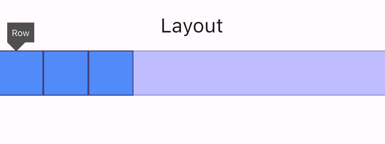
- mainAxisAlignment.start
This property aligns the children close to the start of the main axis.
Representation
- mainAxisAlignment.end
This property aligns the children close to the end of the main axis.
Representation

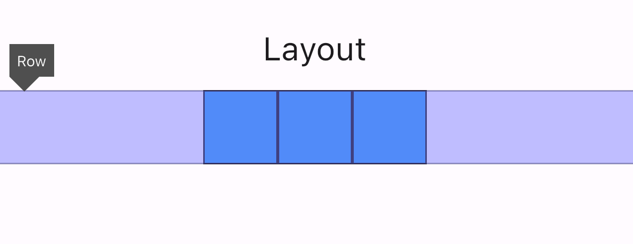
- mainAxisAlignment.center
This property aligns the children as close to the middle of the main axis.
Representation
- mainAxisAlignment.spaceBetween
This property evenly spaces the children on their main axes.
Representation

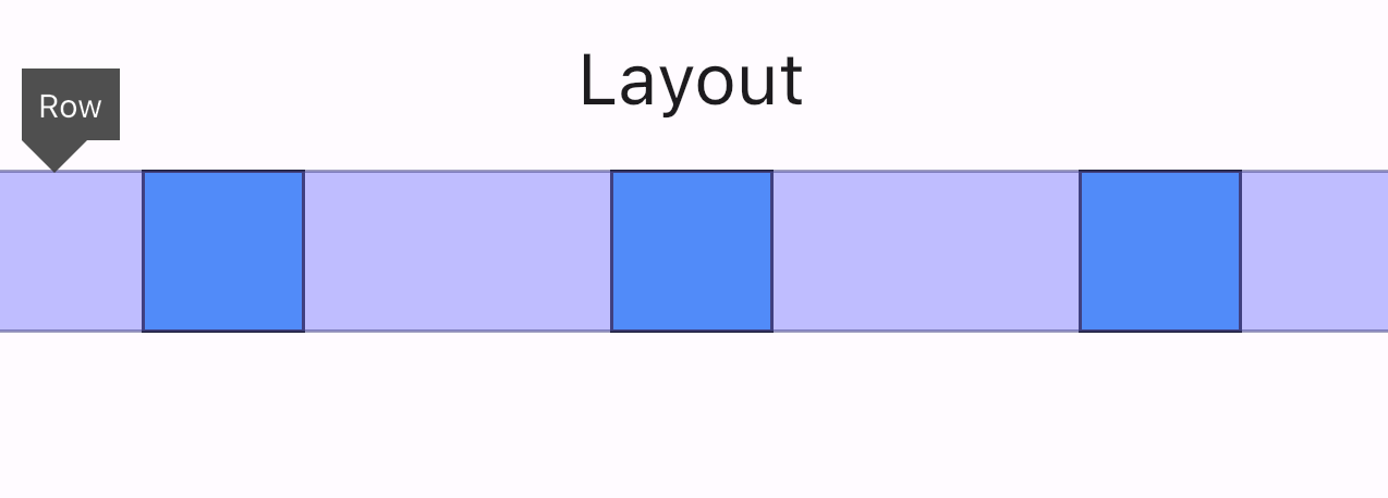
- mainAxisAlignment.spaceAround
This setting evenly spaces the children while reducing half of the space before and after the first and last widgets.
Representation
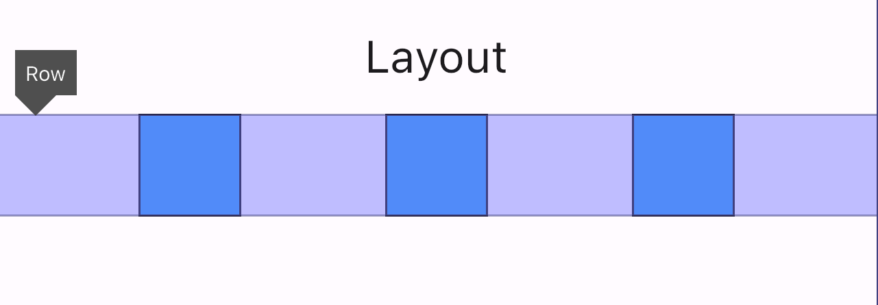
- mainAxisAlignment.spaceEvenly
It divides the extra space evenly between the widgets and before and after the children.
Representation
- crossAxisAlignment:
The crossAxisAlignment determines how the row and the column positions their children on their cross axes.
There are five possible values for CrossAxisAlignment:
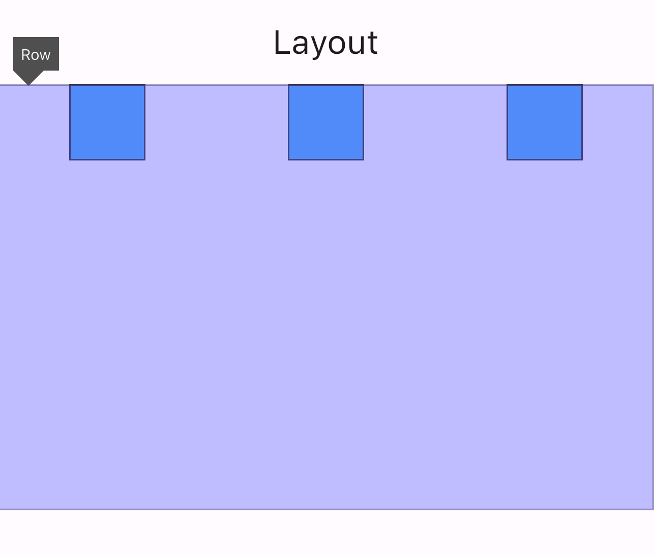
- CrossAxisAlignment.start
This aligns the children at the start of the cross axis.
Representation
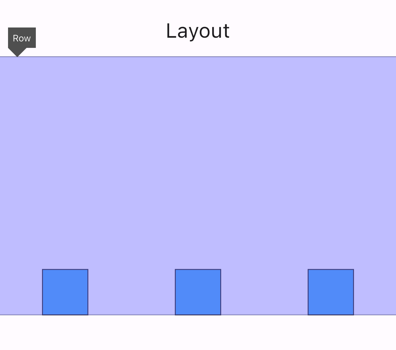
- CrossAxisAlignment.end
It aligns the children at the end of the cross axis.
Representation
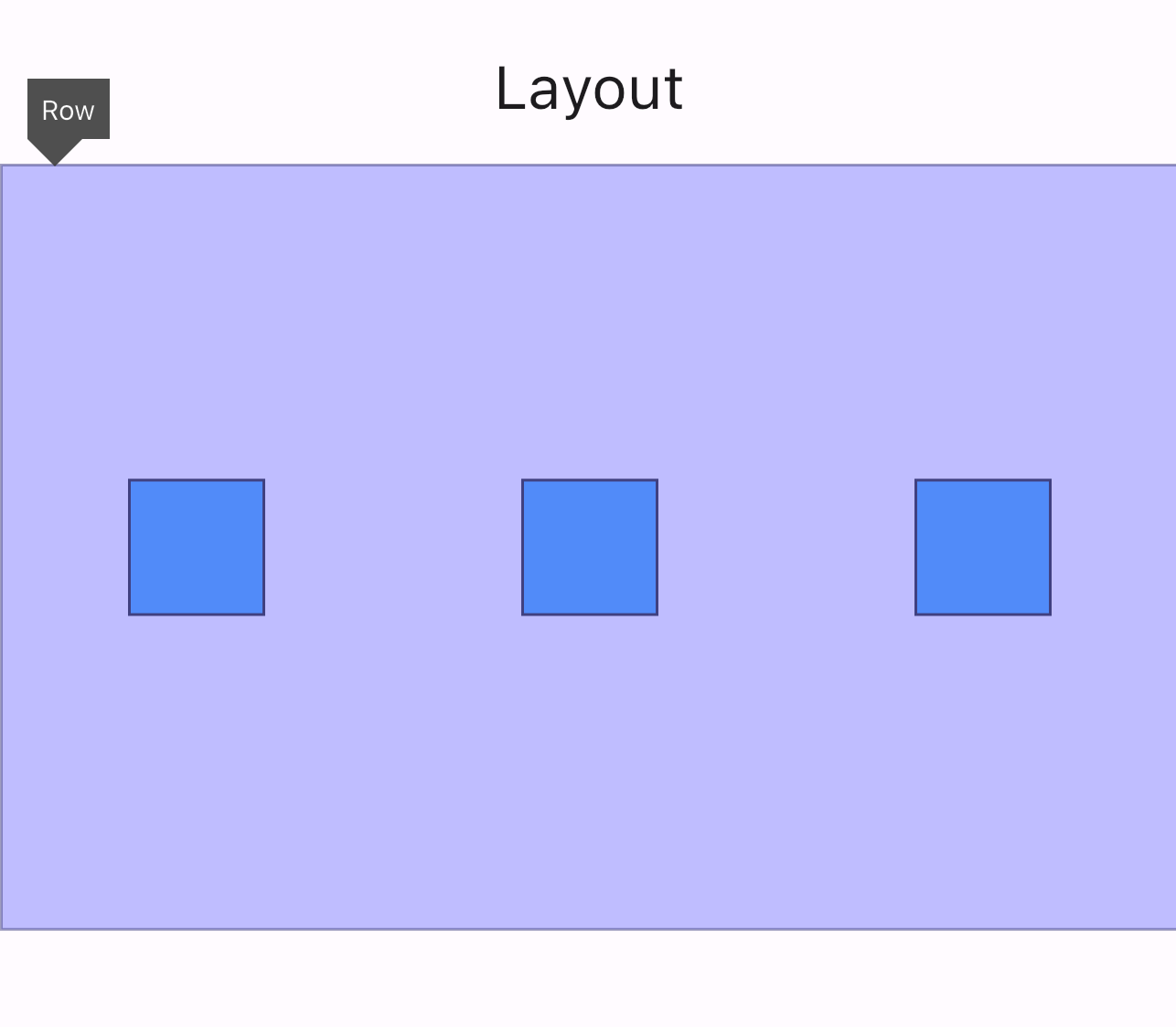
- CrossAxisAlignment.center
This property centers the children along the cross axis.
Representation
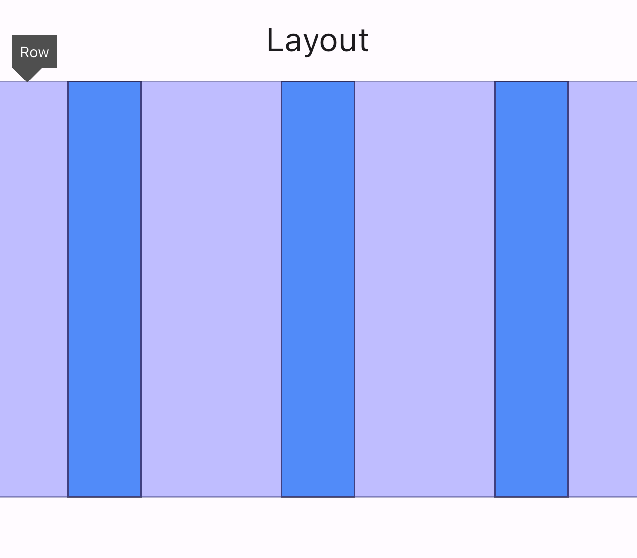
- CrossAxisAlignment.stretch
It stretches the children across the cross axis. For example, in a Row, it stretches from top to bottom.
Representation
- CrossAxisAlignment.baseline
This property aligns characters according to their baselines, which is useful for text elements.
Wrapping Up
And that’s it guys! I hope you have a better understanding of Flutter layouts: MainAxisSize, MainAxisAlignment and CrossAxisAlignment!
About Me
I am Zaahra, a Google Women Techmakers Ambassador who enjoy mentoring people and writing about technical contents that might help people in their developer journey. I also enjoy building stuffs to solve real life problems.
To reach me:
LinkedIn: https://www.linkedin.com/in/faatimah-iz-zaahra-m-0670881a1/
X (previously Twitter): _fz3hra
GitHub: https://github.com/fz3hra
Cheers,
Umme Faatimah-Iz-Zaahra Mujore | Google Women TechMakers Ambassador | Software Engineer
